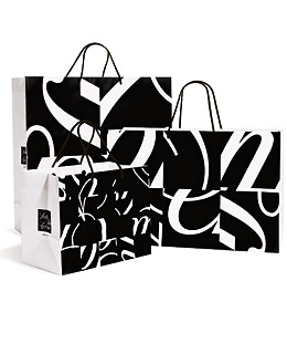
Saks Fifth Avenue
Along Fifth Avenue, the new It bag isn't necessarily Gucci or Fendi; it's Saks Fifth Avenue's redesigned shopping bag, above. "We tried to signal continuous change, the essence of fashion," says Pentagram's Michael Bierut, who redesigned the packaging for the venerable store, "but also convey the timelessness you get in familiar packaging, like the Tiffany blue box." Starting with one idea, that the logo must be a square, Bierut and Terron Schaefer, Saks' creative and marketing senior vice president, found that the cursive logo, last redesigned in the '70s, still resonated with shoppers. Bierut liked the lettering but wanted to update it. So they gave the script "liposuction," says Schaefer, "taking away some of the feminine flourishes." Inspired by painters like Abstract Expressionist Franz Kline, Bierut found that zooming in on the details of the cursive lettering would modernize it. Cutting the script into 64 squares and reassembling them randomly, he created a graphic that could be almost infinitely rearranged—and one that has a life beyond shopping bags, including on an Ellen Tracy blouse, scarf and skirt. With more partnerships in the works, it looks as if Saks could just about give Louis Vuitton and Burberry a run for their money.