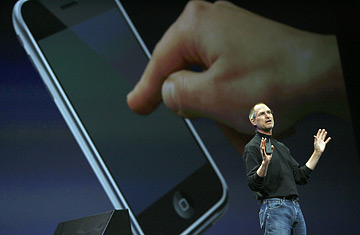
Apple chief executive Steve Jobs unveils a new mobile phone that can also be used as a digital music player and a camera, a long-anticipated device dubbed an "iPhone."
(2 of 5)
That was why, 212 years ago, Jobs sicced his wrecking crew of designers and engineers on the cell phone as we know--and hate-- it. They began by melting the face off a video iPod. No clickwheel, no keypad. They sheared off the entire front and replaced it with a huge, bright, vivid screen--that touch screen Jobs got so excited about a few paragraphs ago. When you need to dial, it shows you a keypad; when you need other buttons, the screen serves them up. When you want to watch a video, the buttons disappear. Suddenly, the interface isn't fixed and rigid, it's fluid and molten. Software replaces hardware.
Into that iPod they stuffed a working version of Apple's operating system, OS X, so that the phone could handle real, nontoy applications like Web browsers and e-mail clients. They put in a cell antenna and two more antennas for wi-fi and Bluetooth, plus a bunch of sensors, so that the phone knows how bright its screen should be and whether it should display vertically or horizontally, and when it should turn off the touch screen so that you don't accidentally operate it with your ear.
Then Jonathan Ive, Apple's head of design--the Englishman who shaped the iMac and the iPod--squashed the case to less than half an inch thick and widened it to what looks like a bar of expensive chocolate wrapped in aluminum and stainless steel. The iPhone is a typical piece of Ive design: an austere, abstract, Platonic-looking form that somehow also manages to feel warm and organic and ergonomic. Unlike my phone. Ive picks it up and points out four little nubbins on the back. "Your phone's got feet on," he says, not unkindly. "Why would anybody put feet on a phone?" Ive has the answer, of course: "It raises the speaker on the back off the table. But the right solution is to put the speaker in the right place in the first place. That's why our speaker isn't on the bottom, so you can have it on the table and you don't need feet." Sure enough, no feet mar the iPhone's smooth lines.
O.K., so it's pretty. Now pick it up and make a call. A big friendly icon appears on that huge screen. Say a second call comes in while you're talking. Another icon appears. Tap that second icon, and you switch to the second call. Tap the "merge calls" icon, and you've got a three-way conference call. It's ridiculously simple.
Another example: voice mail. Until now you've had to grope through your v-mail by ear, blindly, like an eyeless cave creature. On the iPhone you see all your messages laid out visually, onscreen, labeled by caller. If you want to hear one, you touch it. Done. Now try a text message: instead of jumbling them all together in your In box, iPhone arranges your texts by recipient, as threaded conversations made of little jewel-like bubbles. And instead of "typing" on a three-by-four number keypad, you get a display of a full, usable QWERTY keyboard. You will never again have to hit the 7 key four times to type the letter s.
