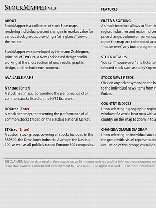
Don't just read about the stock market; absorb it. It's visually possible with StockMapper, which not only posts a statistical table of all stocks but also colors them according to their relative market performance using a so-called heat map. Developed by Hermann Zschiegner, of the New York City–based design studio TWO-N, the site allows users to manipulate the heat maps, organizing by geographic region, industry, index, price change, trading volume and total market capitalization. How cool is that?