The Economist
December 8, 2007
#8. The Economist
Dec. 8, 2007
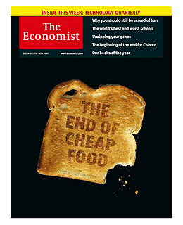
This cover is really smart. It illustrates one of the most important precepts of good cover design, which is that you don't have to spend a bunch of money, or have a team of photographers, stylists and assistants, to produce a terrific image. All you need is imagination and a good eye. The reductive simplicity of the picture — set against a stark black background for maximum graphic impact — allows the message to read quickly and clearly. Using toast creates an imbedded pun: Cheap food is toast. (In case you don't get it, the headline, cleverly burned into the bread, spells it out.) So what did the art director accomplish? A provocative cover that doesn't take a bite out of the magazine's budget. Three cheers for the power of a good idea.