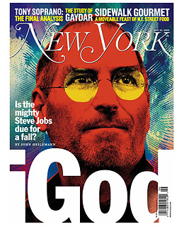
New York magazine
June 25, 2007
#4. New York
June 25, 2007
Sometimes a cover is great for no particular reason — it just kind of rocks. This New York cover on Steve Jobs uses an over-the-top illustration by Sean McCabe (who does the weekly Downtime illustration for TIME). It breaks conventional-wisdom Rule #1, that a cover should always be attractive. This one's really off-putting. But it turns Jobs into a kind of digital Moses, the man who leads his iFlock to the promised land. The garish aesthetics of the illustration are decidedly anti-Apple, which uses spare, white modernist simplicity to communicate its spare modernist simplicity. It doesn't make you feel soothed, like Apple products are supposed to do. Rather, it feels like Steve Jobs has entered an alternative universe. The title, monolithic and clever, amplifies the question on the cover: Will Steve Jobs' messianic vision somehow lead to his undoing? This cover could have been done 100 different ways, but this execution grabs the reader by the lapels and commands attention.