

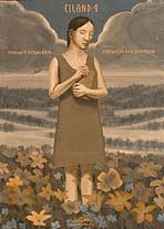
 One Side of "Eiland"
 |
Issue four of "Eiland" (Bries; 28pp.; $13.95), by a pair of Dutch artists, Sefan J.H. van Dinther and Tobias Tycho Schalken, doesn't come at you like a comicbook. You push the contents out of an open-ended cover sleeve. Into your lap plops an eight-and-a-half-foot-long piece of shiny cardstock that has been folded back and forth, accordion-style. Each side of the sheet contains a story by one of the artists, which because of the folding, means the book has no front or back and the end of one turns over to the beginning of the next in a Mobius-loop of comix reading.
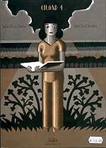 The other side of "Eiland"
 |
The stories are of an equally unconventional nature. Schalken's "Balthazar" is subtitled "Part III: In Apple Blossom Time," and even if we had the benefit of parts one and two, it seems unlikely to satisfy our need for obvious answers. Using a graphical style that combines hand-drawing and computer imagery, "Balthazar" wordlessly captures fragments of a schoolgirl's romantic fantasies. Linear moments, like a handsome teacher reaching out to touch a pretty colleague, are interrupted by panels of the girl dancing, until the entire page gets filled with swirling patterns of people in movement. Breaking down time into fragments has echoes in the accompanying story, "CHRZ," by van Dinther. Basically a bullet, a fly, a woman and a crow are going to be in the same place at the same moment. The depiction of that moment from several different angles becomes the story. At one point van Dinther lays out the page so that it can be read left to right, with each row a different point of view over the course of time, or vertically, with each column depicting the same moment from a different point of view.
|
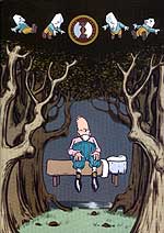
A more accessible but no less interesting book comes from Lincoln, California and the pen of Paul Hornschemeier. "Forlorn Funnies" number one (Absence of Ink Comic Press; 32pp.; $3.95) mixes sophomoric humor with existential despair in a full-color extravaganza that constantly surprises with its design. The opening page shows an archetypical villain, stove-pipe-hatted, handlebar-mustachioed riding his horse. The panels of page two, on the underside, have been lightly printed in the background, backwards, as if you could see through the paper — a kind of literal foreshadowing. Comically frustrated in his villainy, he asks himself "At what point did you stop loving life," as he retires for the evening with a glass of wine and a children's book. When we turn the page, we are reading the children's book. "Forlorn Funnies," continues this way, folding one episode into the next, from a washed-up TV character to a guy lamenting his fallen hamburger to the confused sexual fantasies of a pink-shirted bird-watcher. Through it all Hornschemeier mixes up color palates, layout and drawing styles. The result is a screwy, goofball showcase of comix' unique ability to combine graphic design and storytelling.
Schalken and van Dinther's "Eiland" and Paul Hornschemeier's "Forlorn Funnies" aren't as easy to read as other comix. But they aren't meant to be. You need to put aside conventional notions of how comix can entertain and accept that the challenge of such works becomes the entertainment.
"Eiland" and "Forlorn Funnies" can be found at superior comic stores
NOTE: TIME.comix will be taking another summer breather next week in order to sip iced tea on the beach. It will return August 6.