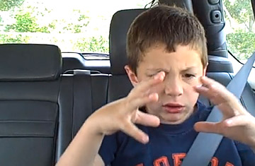
David After Dentist
(4 of 8)
But it's not a permanent solution. Even as YouTube builds up its hoard of user-behavior data, the Youniverse keeps expanding. Moreover, search is useful only for people who know what they're looking for, and more often than not, people don't. Users tend to arrive at YouTube's front door the same way they sit down in front of a TV: with what is known inside the aerodrome as "low intent." They have no plan. They know they want to be entertained, but how or with what, they have no clue. And you can't search if you don't know what you're searching for; in fact, top search terms on YouTube include such plaintively vague requests as "funny videos" and "lol."
If YouTube is going to survive, and make money, and circumvent the square-cube law, new tactics will be required. With that in mind, the people who run YouTube are completely rebuilding it. YouTube needs to pull itself together and help users elevate their intent. If it can do that, it can start to compete with TV--and maybe even, as the beast has been known to do to its rivals, devour it.
You probably haven't thought much about YouTube's background color. Fortunately somebody is thinking about it for you: a smart, intense woman named Margaret Gould Stewart, whose business card reads director of user experience. Stewart oversaw the redesign of YouTube that began to roll out in December and continues in the form of ongoing changes. "We're never done," she says. "Literally, week to week, we're always tweaking."
The challenge Stewart faces is to create a container--her word--that will fit all of YouTube's vastly diverse content and make the task of navigating that content easier. That's why YouTube's background color, which used to be white, is now gray. "When you mat photographs," she says, "quite often you use gray instead of white or black because it tends to bring out a lot more of the nuances in a photograph."
Stewart's team also adjusted the height of YouTube's buttons and the radii of their rounded corners, and changed the way links look (they used to be blue and underlined; now they're just gray). "When you have it all blue and underlined in the default resting state, it really distracts," Stewart says. "This allows people to access that information when it's relevant, but it doesn't shout at them the whole time." Her team also enlarged the thumbnail images very slightly. "That change alone increased clicks to the Watch page by 2%," she says. "We were pretty amazed. We knew it was going to impact user behavior. We just didn't know how."
These are cosmetic changes, obviously. More changes are afoot, of a deeper, structural kind, changes in the very bones of the Youniverse. Whereas the old front page of YouTube was a grid of videos arrayed hopefully in front of you, chosen by some invisible hand for inscrutable reasons, now you get something much more civilized. The first things you see are a tidy list of channels on the left-hand side and a Facebook-style feed running down the middle of the page, consisting of recent videos from those channels on the left.
